Identifying Node Status through PNG Images
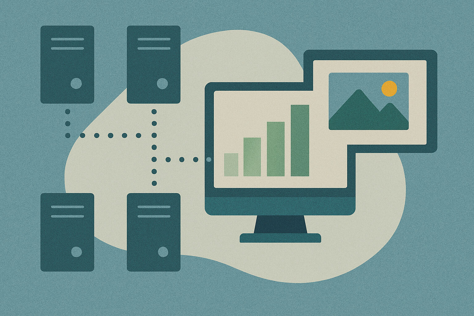
Monitoring each node in a grid system is like tracking the movements of numerous workers in a factory. Each one has a role to play, and if even one slows down, the entire operation can suffer. That’s why it’s helpful to immediately see the condition of each node in a clear visual representation. One of the simplest ways to do this is by using PNG images to depict the performance of each part.
Given the volume of data to check—like CPU usage, memory consumption, and load averages—it’s easier to understand these when presented visually. Not everyone is an expert in reading command-line outputs. But almost anyone can understand colors, shapes, and status markers in a simple image file. Visual aids act as a guide not just for system admins but also for project managers who want to know how the operations are going.
The PNG format is favored by many for its clarity even at small file sizes. Unlike other formats, it doesn’t lose detail when transferred around. For grid systems using automated reporting tools, PNGs can easily be integrated into daily monitoring reports.
Why PNG Format is the Best Choice
There are many image formats available, but there are specific reasons why PNG is often chosen for system visualizations. First is its lossless compression. This means you can save the image multiple times without losing any detail—important when you need to review old logs.
Second, PNG supports transparency. When creating layered charts or overlaying system maps, it’s easy to merge PNGs with other graphics. On dashboards with dark backgrounds, there’s no need to edit out white boxes—everything appears clean and professional.
Third, it’s supported by nearly every software—from basic image viewers to advanced monitoring platforms. There’s no need to convert the image before loading it into reports or dashboards. In automation workflows, one click can attach the status visuals to an email or server log.
Creating Visual Representations of Node Metrics
For PNG images to be useful, they must contain the right information. It’s not enough to have just colors or charts—they must clearly show what they represent. For example, if an image shows CPU load, it should include a color gradient where yellow means light load and red means high load. The same applies to memory usage, network activity, or disk I/O.
A concrete example is using a pie chart to show memory consumption. One segment displays used memory, and the other shows free memory. This way, even those unfamiliar with raw numbers can understand performance status. For real-time updates, a timestamp can be added to indicate when the data was captured.
Using scripts or tools compatible with the grid environment, these PNG images can be generated automatically. Each time a node generates a new performance log, the tool creates an image and adds it to an archive or dashboard. The visual output is consistent, making it easier to track trends or spot anomalies.
Colors as Indicators of System Health
Color plays a key role in visual performance tracking. At a glance, one can tell if something needs attention. Green is typically used for healthy nodes, orange for medium load, and red for overworked or unstable nodes. This simple visual system speeds up decision-making.
In a PNG image with a node map, each circle can represent a node. If all are green, the system is stable. If two turn red, they immediately stand out. There’s no need for a deep dive into logs—color patterns serve as visual cues for administrators.
Sometimes, pulsing effects or gradient scales are used to show load changes over time. For instance, if a node’s circle changes from green to orange, it might signal an increasing load. With this kind of representation, trends are easier to detect before they escalate into issues.
Integrating Visuals into Monitoring Dashboards
System monitoring isn’t complete without a dashboard showing the status of each component. PNG images serve as visual blocks here. At a glance, you can see which nodes are in good shape and which are not.
Platforms like Grafana or custom-built panels support image integration. PNG files are uploaded and arranged according to the grid layout. When image updates are automated, tracking changes becomes easier. Just one refresh and the visuals are up to date.
This isn’t just for aesthetics. Integrating PNG visuals into dashboards improves response time. If an anomaly shows up in an image—even before a system alert is triggered—a technician can already take action. It’s a visual aid that works proactively.
Automating PNG Generation from Node Logs
Manually creating PNG images for each node is not practical. That’s why grid systems rely on automation. For each node’s logging session, a script reads the values and generates a visual output. This automation supports the daily monitoring cycle.
Typically, a script is scheduled via cron or a scheduler system. Every time new data arrives, it’s compiled into a chart and saved as a PNG. Inside each node’s folder, you’ll find image files ready for daily review. When something needs checking, the visual history is already there.
This also helps with auditing tasks. Instead of reviewing long text logs, a glance at a PNG timeline reveals when an issue started. For disaster recovery or post-mortem reviews, analysis becomes faster using these images.
Real-Time Visualization in Grid Clusters
Tracking performance is more effective in real-time. Thanks to dynamic PNG generation, this is now possible—even in complex grid clusters. With each metrics update, a new PNG image is created. Within seconds, a fresh and accurate visual appears.
These real-time PNGs are typically hosted on monitoring portals. When a technician opens the system dashboard URL, they see the current status visually. There’s no delay in feedback—if something is wrong, response can be immediate.
This is especially effective in large systems with hundreds of nodes. Instead of checking them one by one, a single image provides an overview. It’s like a bird’s-eye view of the entire operation—a big help in network operation centers monitoring around the clock.
Archiving and Historical Review with PNG Files
PNGs aren’t just for the present—they’re also great for long-term review. Every day, images are archived. When it’s time for historical analysis, just open the relevant image files and see the past status of the nodes.
For example, if an issue recurs weekly, you’ll notice the pattern in the archived PNGs’ color changes. There’s no need to decode logs—just look at the image to see when problems started. This is especially helpful for system planning and optimization.
Visuals also make reports easier to present to management. Instead of technical graphs or log files, PNGs can be used as timelines or snapshots of system performance. It’s a visual history anyone can understand.
PNG in Cross-Platform Monitoring Setups
One of the best things about PNG is its compatibility across platforms. Whether on Linux, Windows, or web-based tools, PNG files can be opened without conversion or special viewers. This makes them ideal for multi-platform grid systems.
In remote environments where access is limited to email or mobile devices, PNG images can be easily sent as attachments. Even with low bandwidth, they download and open quickly. Sometimes, they serve as the only available status report for off-site admins.
Even in cloud-based setups, PNGs are integrated. Using cloud storage and shared dashboards, performance visuals are still accessible in real-time. There’s no need to be physically present to check node status.
Images as a Communication System
Visualization using PNGs isn’t just about aesthetics—it’s a form of communication. When a technician submits a status report, a color-coded image is clearer than paragraphs of log data. Decision-making is faster and explanations more effective.
Using PNGs bridges the gap between technical and non-technical team members. In project meetings, it’s easier to present using chart-based images than technical tables. In cross-functional discussions, visuals serve as a common language.
So, as grid computing continues to evolve, the value of clear and detailed visual aids remains. PNG images, in their simple form, continue to serve as powerful tools in the day-to-day operation of distributed systems.


